
Buttons with character.
Subtle mouse-following movement, responsive hover states and touch-friendly behaviour.

A living collection of premium web design ideas. No templates. No platform limitations. Just thoughtful design, ambitious code and details worth noticing.
A hero should do more than hold a photograph and a headline. Try three completely different treatments below — built with the same brand palette.
3 LIVE HERO CONCEPTS
Not three static mock-ups. These are live layouts you can switch between, resize and interact with.
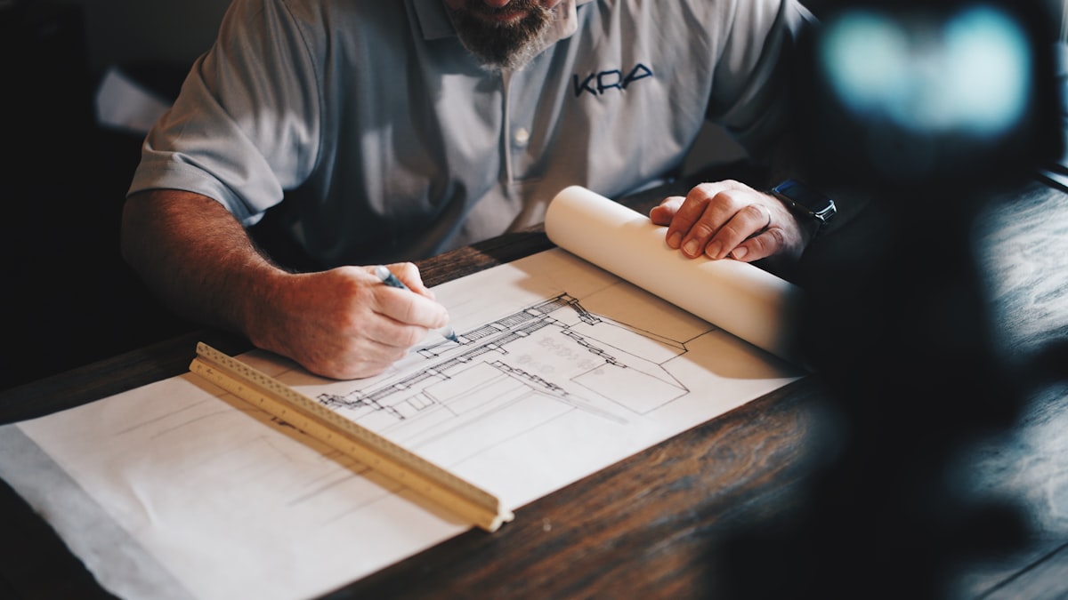 FIG. 01 — MATERIAL & METHOD
A narrow line of text next to an oversized photograph. A headline that interrupts the grid. Deliberate empty space that lets the work breathe.
This is what a custom-coded layout gives you: freedom to compose the page around the story, rather than forcing the story into a prebuilt section.

Variable image sizes, cinematic crops, subtle movement and a full-screen lightbox. Click any image to try it.
Images are illustrative stock photography for this independent design demonstration — not project claims or finished client work.
An interactive image comparison is perfect for renovations, restorations, landscaping, roofing and any work with a transformation worth showing.


Two illustrative photographs demonstrate the interaction; they do not depict the same real project.
Reviews don't need to live in identical little boxes with five stars at the top. Give the words space and make every testimonial feel considered.
The difference was in the details. Everything felt considered, from the very first conversation to the finished result.
Micro-interactions are the moments that make a website feel like it was built, not assembled.
Subtle mouse-following movement, responsive hover states and touch-friendly behaviour.
Responsive typographic transitions that attract attention without overwhelming the page.
Gentle zooms, refined reveal overlays and a visual language that feels intentional.
 DESIGN WITH PURPOSE.
Instead of four identical cards, a carefully paced story helps the important information stand out.
CUSTOM DESIGN THINKING
Every layout is chosen to serve the message, rather than filled into a rigid template.COHESIVE DESIGN LANGUAGE
One visual identity, expressed across completely different compositions.ROOM TO EXPERIMENT
Scroll effects, flexible grids, bespoke navigation, custom forms and interactive features.The smartest details often go unnoticed — until they are missing.
The freedom isn't just in what you can code.
It's in what you can imagine.